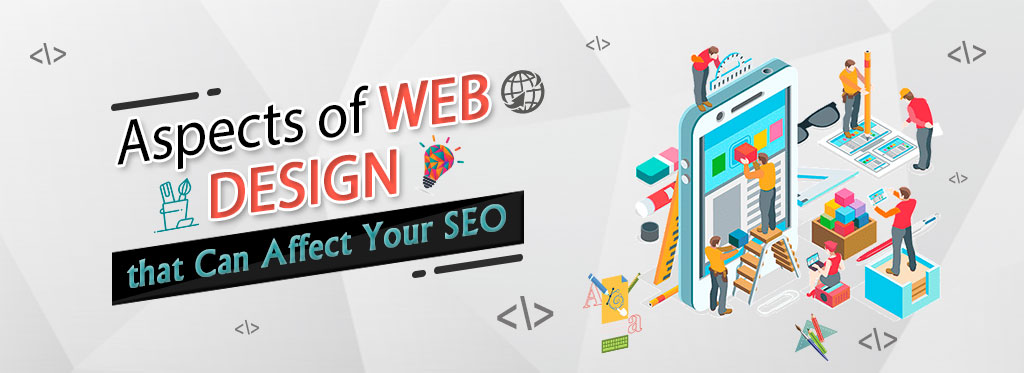
Web design is the method by which content intended for the Internet is designed, conceptualized and organized. Modern web design goes beyond what things look like to cover how things work. Web design is not confined to websites, as it covers other uses such as web applications, smartphone apps and user interface design.
Web design elements
When designing a website, consideration of both the look and the functionality of the site is crucial. Integrating these elements into the architecture would help improve the site’s efficiency no matter how success is calculated.
For example, do you know that web design can have a major impact on your success in search engines like Google due to search engine optimization?
Visual elements
Here’s a short overview of the elements you need to remember in your design to ensure everything looks fine!
Written copy
Essentially the look and words of a website go hand in hand. The two are never really to be considered as different. Having your designers and content writers work together will create a more efficient design, rather than in sequence.
Fonts
When designing a website, choosing easy-to-read font pairings which complement the design is imperative. Tools such as Canvas Font Combinatory can help you find the best match for your font. Web design tools such as PageCloud also provide several font pairings within their framework.
Colors
One of the most important things to remember when designing a website is colors. Bear in mind that several misunderstandings regarding the psychology of color are present here. It’s important to concentrate on aligning your colors with your brand and the message you’re trying to communicate when selecting colors for your site.
Layout
How you decide to structure your content will have a dramatic effect on both your site’s design and its functionality. While there are no clear rules about website design, there are certainly a few guidelines that you should follow. If you don’t know how to write code, knowing the limitations of various website design tools is important, so that you don’t get stuck halfway through your design.
Shapes
In the last few years, the use of graphic elements in web design has really taken off. It can be used to combine beautiful colors and shapes to achieve many things, such as attracting the attention of visitors to your web. With this trend, the biggest challenge are the complexities that emerge when trying to execute the design without having to rely on code.
Spacing
In your design there is a space between every element: the images, the paragraphs, the lines … The letters spaced even! As a rule of thumb it is easier to have too much room than to have things packed together. With modern web designers the idea of whitespace is certainly top of the mind.
Images & Icons
In just a few seconds, beautiful designs can convey a lot of details. One way to do this is by using strong images and icons. A quick search by Google for stock photos or icons will yield thousands of choices.
Videos
Videos are a rising phenomenon among Web designers. When properly used, they will help visitors to your website experience something which simply cannot be represented with words or pictures. One thing to keep in mind is that eye-catching videos will detract from your content and should never interfere with it.
Functional elements
Navigation
Navigation is one of the key components deciding if the website is really “running” Your Nav can serve many purposes, depending on the audience. It lets visitors first explore what you have to offer, while directing visitors back to different parts within your site. There are a couple of best practices that you may want to follow in both cases.
Speed
Nobody likes sluggish pages. No matter how good your concept is, it won’t work in search if it doesn’t load within a reasonable time, so it won’t accomplish your objectives. Although the top site builders usually compress the content to optimize load times, there are no guarantees; do your homework to ensure optimum output is delivered by the tool that you chose.
Animations
There are loads of web animation techniques that can help your design perform a wide range of tasks, from catching the attention of a user to providing input on other interactions with content such as buttons or shapes. If you are new to web design, first we will suggest that you stick to basic animations. Complex animations usually require the intervention of developers.
User interactions
Visitors to your site have several ways to communicate with your site, depending on your computer (scrolling, tapping, typing). These experiences are often streamlined by the best prototypes that give the user the illusion they are in full control. Here are only a few examples:
- Never auto-play audio
- Never underline text unless it’s clickable
- Make forms mobile-friendly
- Avoid pop ups
- Avoid scrolljacking
Site structure
The layout of a website plays a major role both in user experience and in SEO. If people get lost navigating through your pages, there are chances that crawlers too would. While some free sitemap builders are available online, often the best way for small sites is to print out the pages on a whiteboard or on a piece of paper.
Cross-browser & cross-device compatibility
All apps and browsers should have a great interface and look fantastic. We would suggest using a cross browser testing tool to make this repetitive process quicker and more effective if you are developing your site from scratch. On the other hand, if you use a website building tool, the cross browser testing is usually carried out by the development team of the company, which lets you focus on the design.
Types of website design
Even though you could find articles online talking about a whole bunch of website design styles (fixed, static, dynamic, etc.), there are only two ways to properly design a website in today’s mobile first world: adaptive and responsive websites.
The best thing is that you don’t have to learn how to code with modern design software to create beautiful websites which look fantastic on all devices.
Understanding the pros and cons of websites that are flexible and sensitive will help you decide what’s right for you.
Adaptive web design
Adaptive web design uses two or more website models, which are tailored to various screen sizes. Adaptive websites can be divided into two key groups, depending on how the website senses what “version” wants to be seen.
Adapts based on device type
When your browser (aka client) connects to a website, a field called “user-agent” will be included in the HTTP request, which will notify the server of the type of device attempting to access the page.
This essentially means that the website knows which version to view (ex: desktop or mobile). The only drawback with this strategy is that if you shorten the browser window on a laptop the page will not change so the complete “laptop edition” will continue to appear.
Adapts based on browser width
Instead of using the “user-agent,” the website is flipping between versions using media-queries and breakpoints. Therefore, you can have 1080px, 768px, and 480px width versions instead of having a laptop, tablet, and smartphone versions. In addition to providing more flexibility when designing, this approach provides a more “open” look when adjusting your browser’s size on a wide screen.
Pros
WYSIWYG editing (What you see is what you get) Custom designs are quicker and simpler to create without cross-browser code and software compatibility.
Cons
Websites using “web sort” can look broken when viewed in a small browser window on a desktop limitations for some effects that can only be achieved by sensitive sites
Responsive web design
Sensitive websites use a mix of versatile (percentage-based) grids with breakpoints (using media queries) to construct a personalized look at each screen size. Unlike adaptive sites which only change when they reach a breakpoint, responsive websites are constantly changing depending on the size of the screen.
Pros
Excellent experience at any screen size, regardless of the computer typeResponsive website builders are usually rigid, making the design difficult to “break” Loads of models available to start from
Cons
Requires comprehensive design and testing to ensure quality (starting from scratch) Note: Adaptive websites can contain responsive elements without accessing the code. For example, you can create image galleries to be completely responsive while the rest of the site is adaptive.
Website design tools
There are two key ways a website can be designed: using a mobile app or a website builder. The tool that you decide to use can differ considerably depending on the size of your staff, your budget, the type of site and its technical requirements.
Desktop apps
Photoshop and Sketch are the most popular mobile apps for designing a web site. This method allows designers to create a specification and convert the specification and code before submitting it to a development team.
This is usually the de facto norm for large or complex websites, as it allows the designer to concentrate on look and feel while passing all the technical problems to the dev team
Unfortunately, when various resources and specialized expertise are involved this process can be expensive and time-consuming.
To avoid involving a developer, the use of a website builder can be helpful in designing a website with less technical requirements.
Website builders
There are many choices on the market today for building websites. Not all of them can be called “web design tools,” as editing limitations can make making something custom without having to rely on code very difficult.
For example, while Wordpress is the most commonly used platform for websites, visual designers are not very popular with this. Developers who execute projects usually use this.
These are various elements that has to be considered while designing your website. We at Skew Infotech Pvt Ltd, an Web Designing Company in Coimbatore, offer web design services at affordable and effective prices. With an energetic team, we promise you the best and creative design for your website.